Recently, I announced that my paper Parabolic Properties from Pieces of String had been published in the magazine Math Horizons. The article had multiple aims; in chronological order of when I first started thinking about them:
Prove that string art from two line segments traces a parabola.
Prove that a quadratic polynomial satisfies the focus-directrix property of a parabola, which is the reverse of the usual logic when students learn conic sections.
Prove the reflective property of parabolas.
Accomplish all of the above without using calculus.
While I’m generally pleased with the final form of the article, the necessity of publication constraints somewhat abbreviated the original goal of this project: determining a pedagogically sound way of convincing a bright Algebra I student that string art unexpectedly produces a parabola. While all the necessary mathematics is in the article, I think the article is somewhat lacking on how to sell the idea to students. So, in this series of posts, I’d like to expand on the article with some pedagogical thoughts about connecting string art to parabolas.
As discussed previous posts, we begin our explorations with string art connecting evenly spaced points on line segments and with endpoints , , and . We will call these colored line segments “strings.” We then found the string with the largest coordinate at , resulting in the following picture:
However, perhaps it’s clearer to plot these points on a separate graph, without the clutter of the strings:
These points are definitely following some kind of curve. In the previous posts, we established algebraically that the curve is the parabola .
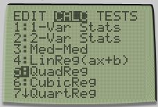
A more modern way of convincing students that the points lie on a parabola is by using technology: specifically, quadratic regression. First, we can input the nine points into a scientific calculator.
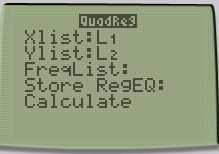
Then we ask the calculator to perform quadratic regression on the data.
The calculator then returns the result:
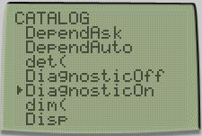
The best quadratic fit to the data is , or as before. The line indicates a correlation coefficient of 1, meaning that the points lie perfectly on this parabola. A parenthetical note: If the line does not appear using a TI-83 or TI-84, this can be toggled by using DiagnosticOn:
I’ve presented three different ways that algebra students can convince themselves that the nine points generated by the above string art indeed lie on a parabola. I don’t suggest that all three methods should be used for any given student; as always, if one technique doesn’t appear to work pedagogically, then perhaps a different explanation might work.
However, our explorations aren’t done yet. Any of these three techniques may convince algebra students that the strings above trace a parabola. Unfortunately, checking that a statement is true for a few points (in our case, ) does not constitute a complete proof for all points. Furthermore, it’s conceivable that “fuller” string art with additional strings, like the picture below, may identify a new string with a higher coordinate than a colored point.
So we have more work to do to prove our assertion that string art traces a parabola. We begin this next phase of our investigations in the next post.
Recently, I announced that my paper Parabolic Properties from Pieces of String had been published in the magazine Math Horizons. The article had multiple aims; in chronological order of when I first started thinking about them:
Prove that string art from two line segments traces a parabola.
Prove that a quadratic polynomial satisfies the focus-directrix property of a parabola, which is the reverse of the usual logic when students learn conic sections.
Prove the reflective property of parabolas.
Accomplish all of the above without using calculus.
While I’m generally pleased with the final form of the article, the necessity of publication constraints somewhat abbreviated the original goal of this project: determining a pedagogically sound way of convincing a bright Algebra I student that string art unexpectedly produces a parabola. While all the necessary mathematics is in the article, I think the article is somewhat lacking on how to sell the idea to students. So, in this series of posts, I’d like to expand on the article with some pedagogical thoughts about connecting string art to parabolas.
As discussed previous posts, we begin our explorations with string art connecting evenly spaced points on line segments and with endpoints , , and . We will call these colored line segments “strings.” We then found the string with the largest coordinate at , resulting in the following picture:
However, perhaps it’s clearer to plot these points on a separate graph, without the clutter of the strings:
These points are definitely following some kind of curve. In the previous post, we established that the curve is a parabola by using the vertex form of a parabola .
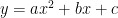
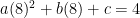
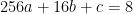
In this post, we use the other general form. If the curve is a parabola, then the equation of the curve must be for some values of , , and . Since there are three unknowns, we need to have three equations to solve for them. This can be done by plugging in three pairs into this equation. While we can pick any three pairs that we wish, it seems convenient to use the points , and :
This simplifies to the system of linear equations
In general systems of linear equations can be challenging for students to solve. However, while this is technically a system, it’s clear that , and so this reduces to a system
or
or
.
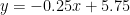
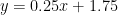
In algebra, students are taught multiple ways of solving systems of linear equations, and any of these techniques can be used at this point to solve for and . Perhaps the easiest next step is subtracting the two equations:
Substituting into , we see that
.
We conclude that , , and , so that, if the points lie on a parabola, the equation of the parabola must be
.
By construction, this parabola passes through , , and . To show that this actually works, we can substitute the other six values of :
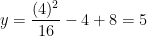
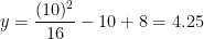
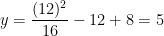
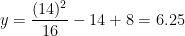
At :
At :
At :
At :
At :
At :
Therefore, the nine points in the above picture all lie on the parabola .
In the next post, we’ll discuss a third way of convincing students that the points lie on this parabola.
Recently, I announced that my paper Parabolic Properties from Pieces of String had been published in the magazine Math Horizons. The article had multiple aims; in chronological order of when I first started thinking about them:
Prove that string art from two line segments traces a parabola.
Prove that a quadratic polynomial satisfies the focus-directrix property of a parabola, which is the reverse of the usual logic when students learn conic sections.
Prove the reflective property of parabolas.
Accomplish all of the above without using calculus.
While I’m generally pleased with the final form of the article, the necessity of publication constraints somewhat abbreviated the original goal of this project: determining a pedagogically sound way of convincing a bright Algebra I student that string art unexpectedly produces a parabola. While all the necessary mathematics is in the article, I think the article is somewhat lacking on how to sell the idea to students. So, in this series of posts, I’d like to expand on the article with some pedagogical thoughts about connecting string art to parabolas.
As discussed previous posts, we begin our explorations with string art connecting evenly spaced points on line segments and with endpoints , , and . We will call these colored line segments “strings.” We then found the string with the largest coordinate at , resulting in the following picture:
However, perhaps it’s clearer to plot these points on a separate graph, without the clutter of the strings:
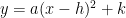
These points are definitely following some kind of curve. Let’s suppose that the curve is a parabola. The vertex form of a parabola is
.
If the curve is a parabola, then clearly the vertex will be the lowest point on the axis of symmetry. By inspection, this point is , which is labeled in the above picture. So, if it’s a parabola, the equation has the form
.
To find the value of , we note that the point must be on the parabola, so that
.
Therefore, the equation of the conjectured parabola is
.
So, if the curve is a parabola, it must follow the function this curve. By construction, this parabola passes through and . To show that this actually works, we can substitute the other seven values of :
At :
At :
At :
At :
At :
At :
At :
Therefore, the nine points in the above picture all lie on the parabola .
In the next couple of posts, we’ll discuss a couple of different ways of establishing that the points lie on this parabola.
Recently, I announced that my paper Parabolic Properties from Pieces of String had been published in the magazine Math Horizons. The article had multiple aims; in chronological order of when I first started thinking about them:
Prove that string art from two line segments traces a parabola.
Prove that a quadratic polynomial satisfies the focus-directrix property of a parabola, which is the reverse of the usual logic when students learn conic sections.
Prove the reflective property of parabolas.
Accomplish all of the above without using calculus.
While I’m generally pleased with the final form of the article, the necessity of publication constraints somewhat abbreviated the original goal of this project: determining a pedagogically sound way of convincing a bright Algebra I student that string art unexpectedly produces a parabola. While all the necessary mathematics is in the article, I think the article is somewhat lacking on how to sell the idea to students. So, in this series of posts, I’d like to expand on the article with some pedagogical thoughts about connecting string art to parabolas.
As discussed in the previous post, we begin our explorations with string art connecting evenly spaced points on line segments and with endpoints , , and . We will call these colored line segments “strings.”
We now ask the following two questions:
For each of $x = 2, 4, 6, 8, 10, 12,$ and , which string has the largest coordinate?
For each of these values of , what is the value of this largest coordinate?
Evidently, for , the brown string that connects to has the largest coordinate. This point is marked with the small brown circle. From the lines on the graph paper, it appears that this brown point is .
For , the horizontal green string appears to have the largest coordinate, and clearly that point is .
For , the pink string that connects to has the largest coordinate. From the lines on the graph paper, it appears that this point is .
Unfortunately, for , , , and , it’s evident which string has the largest coordinate, but it’s not so easy to confidently read off its value. For this example, this could be solved by using finer graph paper with marks at each quarter (instead of at the integers). However, it’s far better to actually use the point-slope formula to find the equation of the colored line segments.
For example, for , the red string has the largest coordinate. This string connects the points and , and so the slope of this string is . Using the point-slope form of a line, the equation of the red string is thus
Substituting , the coordinate of the highest string at is .
Similarly, at , the equation of the orange string turns out to be , and the coordinate of the highest string at is .
At , the equation of the blue string is , and the coordinate of the highest string at is .
Finally, at , the equation of the purple string is , and the coordinate of the highest string at is .
The interested student could confirm the values for , , and that were found earlier by just looking at the picture.
We now add the coordinates of these points to the picture.
However, perhaps it’s clearer to plot these points on a separate graph, without the clutter of the strings:
These points are definitely following some kind of curve. In the next post in this series, I’ll discuss a way of convincing students that the curve is actually a parabola.
Recently, I announced that my paper Parabolic Properties from Pieces of String had been published in the magazine Math Horizons. The article had multiple aims; in chronological order of when I first started thinking about them:
Prove that string art from two line segments traces a parabola.
Prove that a quadratic polynomial satisfies the focus-directrix property of a parabola, which is the reverse of the usual logic when students learn conic sections.
Prove the reflective property of parabolas.
Accomplish all of the above without using calculus.
While I’m generally pleased with the final form of the article, the necessity of publication constraints somewhat abbreviated the original goal of this project: determining a pedagogically sound way of convincing a bright Algebra I student that string art unexpectedly produces a parabola. While all the necessary mathematics is in the article, I think the article is somewhat lacking on how to sell the idea to students. So, in this series of posts, I’d like to expand on the article with some pedagogical thoughts about connecting string art to parabolas.
To begin, we use graph paper to sketch to draw coordinate axes, the point , the point , the point , line segment , and line segment .
Along , we mark the evenly spaced points , , , , , , and .
Along , we mark the evenly spaced points , , , , , , and .
Next, we draw line segments of different colors to connect:
and
and
and
and
and
and
and
The result should look something like the picture below:
It looks like the string art is tracing a parabola. In this series of posts, I’ll discuss one way that talented algebra students can convince themselves that the curve is indeed a parabola.
In my capstone class for future secondary math teachers, I ask my students to come up with ideas for engaging their students with different topics in the secondary mathematics curriculum. In other words, the point of the assignment was not to devise a full-blown lesson plan on this topic. Instead, I asked my students to think about three different ways of getting their students interested in the topic in the first place.
I plan to share some of the best of these ideas on this blog (after asking my students’ permission, of course).
This student submission comes from my former student Sydney Araujo. Her topic, from Precalculus: finding the domain and range of a function.
How can this topic be used in your students’ future courses in mathematics or science?
Expanding on finding the domain, this topic is frequently seen in calculus classes. Students need to understand the domain to understand and find limits of functions. Continuity directly expands on domain & range and how it works. We also see domain and range when students are exploring projectile motion. This makes since because when we think about projectile motion, we think about parabolas. With projectile motion there is a definite start, end, and peak height of the projectile. So we can use the domain to show how far the projectile travels and the range to show how high it travels. Looking even further ahead when students start to explore different functions and sets, they start to learn about a codomain and comparing it to the range which is a very valuable concept when you start to learn about injective, surjective, and bijective functions.
How can technology (YouTube, Khan Academy [khanacademy.org], Vi Hart, Geometers Sketchpad, graphing calculators, etc.) be used to effectively engage students with this topic?
Desmos is a great website for students to use when exploring domain and ranges. Desmos has premade inquiry-based lessons for students to explore different topics. Teachers also have the option of creating their own lessons and visuals for their students to interact with. Desmos can also animate functions by showing how they change with a sliding bar or actually animate and show it move. This would be a great tool to use for students to visually understand domain and ranges as well as how they are affected when asymptotes and holes appear. This would also be great for ELLs because instead of focusing on just math vocabulary, they can actually visually see how it connects to the graph and the equation. For example, https://www.desmos.com/calculator/vz4fjtugk9, this ready-made desmos activity actually shows how restricting the domain and range effects the graph and what parts of the graph are actually included with the given domain and range.
How has this topic appeared in pop culture (movies, TV, current music, video games, etc.)?
Like I discussed earlier, domain and range is directly used in calculus. In the movie Stand and Deliver, they directly discuss the domain and range of functions. The movie Stand and Deliver is about a Los Angeles high school teacher, Jaime Escalante, who takes on a troublesome group of students in a not great neighborhood and teaches them math. He gets to the point where he wants to teach them calculus so they can take the advanced placement test. If they pass the advanced placement test then they get college credit which would motivate them to actually go to college and make a better life for themselves. However through great teaching and intensive studying, the students as a whole ace the exam but because of their backgrounds they are accused of cheating and must retake the exam. There is a few scenes, but one in particular where the students are finally understanding key concepts in calculus and Mr. Escalante is having them all say the domain of the function repeatedly.
In my capstone class for future secondary math teachers, I ask my students to come up with ideas for engaging their students with different topics in the secondary mathematics curriculum. In other words, the point of the assignment was not to devise a full-blown lesson plan on this topic. Instead, I asked my students to think about three different ways of getting their students interested in the topic in the first place.
I plan to share some of the best of these ideas on this blog (after asking my students’ permission, of course).
This student submission again comes from my former student Emma White. Her topic, from Algebra: multiplying binomials.
How could you as a teacher create an activity or project that involves your topic?
When it comes to multiplying binomials, there are various activities that can make this topic interesting and fun. Furthermore, I believe this activity will make the topic of multiplying binomials stick in the students’ heads. For those reading, note that when I refer to FOIL, this is a method that lets you multiply two binomials in a particular order. It stands for: First, Outer, Inner, and Last (for more information on this concept, “Multiplying Binomials by the FOIL Method” by Professor Dave Explains on YouTube does a wonderful job of explaining the concept. The link is down below and skip to time stamp 1:00 for binomials). One resource that makes multiplying binomials more tangible is “FOIL Bingo”. In the resource provided below, a teacher took the time to create various bingo cards with two binomials in each square. The students would have to solve the binomials and when the teacher calls out the product of the binomials, the students would cover that spot and so forth. It is like regular bingo where you want to get a certain amount in a row, blackout the card, get a certain design, etc. The choice is up to the teacher. Another way to do this game (if you’re wanting to conserve time), if give the students a bingo sheet for homework the day before or even as an entry ticket the day of. Then the student could solve the binomials prior to playing the game and will have the answers in front of them instead of having to wait for each student to solve the problem during the game. This could eliminate the risk of going too slow and having students get bored or going too fast and having those who need more time to solve left behind. Lastly, the layout provided in Excel can be altered. Therefore, you could change the values if you wanted to do this activity with your class more than once.
What interesting things can you say about the people who contributed to the discovery and/or the development of this topic?
Around 600-700 AD, the Hindu mathematicians had taken the Babylonia methods of approaching equations a step further when it came to introducing unknowns, sometimes more than one unknown in a single problem. It wasn’t until the Medieval times did the Islamic mathematicians discuss the variable x and how important it was. This is when the binomials theorems evolved. Furthermore, the Islamic mathematicians were able to use many operations on polynomials and soon binomials, such as multiplication, division, finding roots, and more! One thing I find highly fascinating is the Islamic mathematicians advanced the study of algebra, which “flourished during the golden age”. Evermore so, private collections were found in a lost Islamic library, which was destroyed in the 13th Century. These private collections “altered the course of mathematics.” An example of a concept that was furthered studied was the Fibonacci sequence (which is, in my opinion, one of the most fascinating things in math history and how it relates to the world and finding mathematics around us, but that is for another time…). All I can say is the Babylonians, the Hindu and Islamic mathematicians were a driven and mathematically inclined people and it blows my mind how far these people brought the world of mathematics.
How can technology (YouTube, Khan Academy [khanacademy.org], Vi Hart, Geometers Sketchpad, graphing calculators, etc.) be used to effectively engage students with this topic?
When it comes to finding ways to use technology for multiplying binomials, I truly believe visuals are essential. I’m a little biased since I was introduced to a way of multiply binomials just last semester in one of my teaching classes and it BLEW MY MIND. I wish I knew how to do this earlier in high school! Essentially, this online source allows the student to use algebra tiles without having them physically in front of them. Therefore, they can use this source if they have technology capable of doing so (such as a phone, computer, tablet, etc.). This source is visual and easy for students to understand and manipulate. The student starts by placing the corresponding tiles for one binomial across the top like a table (would be 4 x-tiles and 2 1-tiles). Along the left side, the other binomial is represented (long ways/up-and-down). You then multiply corresponding values and where they meet in the open area (example: where an x-tile and another x-tile meet, it would become since x times x is ). Algebra tiles can also be used for upcoming topics the students would learn, such as completing the square. For a student who may have trouble grasping the idea of multiplying binomials and struggling to understand the concept of abstracts, using algebra tiles will hopefully help with the misunderstandings and confusion. All I’m saying is if this concept of online algebra tiles assisted a college student and made the topic MUCH easier to visualize and explain, I’m sure most high school students will find the use of technology in their math class interesting. Who knows, some students may come to love math more because of it!
Reference(s):
“Multiplying Binomials by the FOIL Method” by Professor Dave Explains:
In my capstone class for future secondary math teachers, I ask my students to come up with ideas for engaging their students with different topics in the secondary mathematics curriculum. In other words, the point of the assignment was not to devise a full-blown lesson plan on this topic. Instead, I asked my students to think about three different ways of getting their students interested in the topic in the first place.
I plan to share some of the best of these ideas on this blog (after asking my students’ permission, of course).
This student submission again comes from my former student Morgan Mayfield. His topic, from Algebra: graphs of linear equations.
What interesting (i.e., uncontrived) word problems using this topic can your students do now? (You may find resources such as http://www.spacemath.nasa.gov to be very helpful in this regard; feel free to suggest others.)
Given a rather vague statement such as ”Graphs of Linear Equations”, I was unsure if it meant only the technique of analyzing graphs or being able to have the ability to build a graph of a linear equation. In A1, I attempt to rely on analysis. Here are the problems I encountered on Space Math @ NASA:
Problem 1 – Calculate the Rate corresponding to the speed of the galaxies in the Hubble Diagram. (Called the Hubble Constant, it is a measure of how fast the universe is expanding).
Problem 2 – Calculate the rate of sunspot number change between the indicated years.
Space Math has these problems listed as “Finding the slope of a linear graph”, the two key phrases being “Finding the slope” and “linear graph”. The students must be able to do both. Students are given three sets of graphical data to analyze (shown below). I am not an expert in any of these fields, but I suspect these graphs were made using real data scientists collected. The Space Math team gave students two points on the data to aid in calculations. What makes these graphs interesting is the fact that they are messy, but real compared to a graph of a linear equation in a classroom. These graphs can be analyzed further than the problems Space Math offered. Students could see how that data can be collected and put into a scatterplot, like in the case of graph 2, and have an approximately linear correlation. Sadly, most things don’t follow a neat model of what we see in our math class, yet we can still derive meaning from real-world phenomena because of what we learn in math class. Scientists use their understanding of graphs of linear equations and linear models to analyze data and come to conclusions about our real-world environment. In graph 2, a scientist would clearly see that there is a linear proportional relationship between the speed and distance from the Hubble space telescope of a galaxy, or more meaningfully understood as a rate, 76 km/sec/mpc. Now, if a scientist encountered a new galaxy, they could determine an approximate speed or distance of the galaxy given the other variable.
How can this topic be used in your students’ future courses in mathematics or science?
Students will formalize learning about graphing linear function in Algebra I. Graphs of linear equations are important in solving linear inequalities in two variables, solving systems of linear inequalities, solving systems of linear equations, and solving systems of equations involving linear and nonlinear equations which are all topics in Algebra I and II. Solving systems can be done algebraically, but graphing systems give students a more concrete way in finding a solution and is an excellent way of conveying information to others. If a student ever found themself in a business class, they may be asked to make “business decisions” on a product to buy. If I were the student explaining my decision to my teacher and potential “investors”, I would be making a graph of linear systems to help explain my “business decisions”. Generally, a business class would also introduce “Supply and Demand” graphs, where the solution is called the “equilibrium”. Many graphs in an intro class depict supply and demand as a system of linear equations.
In the high school sciences, a student will come across many linear equations. Students in a regular physics course and an AP physics course will come across simplified distance vs. time graphs to represent velocity, velocity vs. time graphs to represent acceleration, and force vs. distance graphs to represent work and energy (khan academy link included below). Note, just because many of the examples used in a physics class are graphs of linear equations, real life rarely works out like this.
How has this topic appeared in pop culture (movies, TV, current music, video games, etc.)?
We are shown data daily that our climate is changing fast through infographics on social media, posters set up by environmentalists, and news broadcasting. Climate change is one of the most important issues that society faces today and is on the collective consciousness of my generation as we have already seen the early consequences of climate change. Climate change, like most real-world data collecting does not always follow a good linear fit or any other specific fit with 100% accurately. However, a way scientists and media want to convey a message to us is to overlay a “trend line” or a “line of best fit” over the graphed data. Looking at the examples below, we can clearly understand that average global temperatures have been on the rise since 1880 despite fluctuations year-to-year and comparisons to the expected average global temperature. The same graph also gives insight on how the same data can also be cherrypicked to fit another person’s agenda. From 1998 – 2012, the rate of change, represented by a line, is lower than both 1970 – 1984 and 1984 – 1998. In fact, the rate is dramatically lower, thus climate change is no more! Not so, this period of slowing down doesn’t immediately refute the notion of climate change but could be construed as so. Actually, in the NOAA article linked below and its corresponding graph actually finds that we were using dated techniques that led to underestimates and concluded that the IPCC was wrong in it’s original analysis of 1998-2012 and that the trend was actually getting worse, indicated by the trend line on the second graph, as the global temperature departed from the long-term average.
Look at how much information could be construed by a few linear functions represented on a graph and some given rate of changes.
In my capstone class for future secondary math teachers, I ask my students to come up with ideas for engaging their students with different topics in the secondary mathematics curriculum. In other words, the point of the assignment was not to devise a full-blown lesson plan on this topic. Instead, I asked my students to think about three different ways of getting their students interested in the topic in the first place.
I plan to share some of the best of these ideas on this blog (after asking my students’ permission, of course).
This student submission again comes from my former student Bri Del Pozzo. Her topic, from Algebra: finding the slope of a line.
How could you as a teacher create an activity or project that involves your topic?
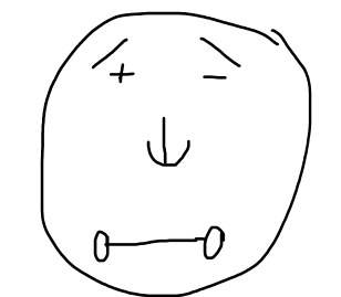
As a teacher I would likely introduce a very popular and well-received project to my students, the project where students draw an angular image on a graph and then calculate the slope of 20 lines from their image. I love this project because it allows students to connect mathematics to art and encourages them to express themselves creatively. As a precursor to the project, I would introduce students to the types of slopes and their characteristics using a tool that I learned in my Algebra Class, Mr. Slope Guy (pictured below).
In the image the positive slope is indicated by the left eyebrow and above the plus-sign eye, the negative slope is the right eyebrow by the negative sign eye, the nose represents the undefined slope and is denoted by a vertical line and a “u” for undefined, and the mouth represents the zero-slope shown by a horizontal line and two zeros. The students could use this resource while completing their projects to serve as a reminder of the types of slopes. The main focus of the project, however, would focus on the process of how to find slope given two points on a line.
(This project is based on an example from: https://kidcourses.com/slope/ #5)
How does this topic extend what your students should have learned in previous courses?In the grade 7 TEKS for mathematics, students are expected to “represent linear relationships using verbal descriptions, tables, graphs, and equations that simplify to the form .” This creates a foundation for finding the slope of a line by introducing students to multiple representations of what slope looks like. When discussing how to find the slope of a line, I think that the tabular representation is a great tool for students to visualize the meaning behind slope. In seventh grade math, students were able to conceptualize slope without using the formula. When finding slope in early algebra, I would encourage students to look at graphs from a new lens, noticing features such as the sign of the line, the steepness of the line, the difference in x’s and y’s at different points on the line, and the slope itself. When looking at a table, I would ask students to calculate the difference in x’s and y’s as they go down the rows of the table and have them compare those numbers to those that they saw in the graph.
How has this topic appeared in the news?As many of us know, over the past 18 months or so, the number of Covid-19 Cases in the United States has been on the rise. For a long time, the total number of cases in the United States was growing exponentially and very quickly. As more research has been done by the Centers for Disease Control and Prevention, we have learned that there is a way to flatten the curve and reduce the number of daily cases. This initiative to flatten the curve has resulted in the growth of cases to resemble liner growth rather than exponential growth. As mathematicians, we can calculate the slope of the line that represents the (linear) growth of Covid-19 cases per day. We can make comparisons between growth rates in different states and use that data to make predictions about effectiveness of Covid-19 prevention procedures.


 .
. for some values of
  ,
,  , and
, and  . Since there are three unknowns, we need to have three equations to solve for them. This can be done by plugging in three
  pairs into this equation. While we can pick any three pairs that we wish, it seems convenient to use the points
  ,
,  and
and  :
:

 system of linear equations

 , and so this reduces to a
  system


 .
.


 .
. ,
,  :
: :
: 
 :
: 
 :
: 
 :
: 
 :
: 
 :
: 
 in the above picture. So, if it’s a parabola, the equation has the form
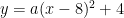 .
. must be on the parabola, so that


 .
. :
: 

 , which string has the largest
  , the brown string that connects
  to
to  has the largest
  .
. , the horizontal green string appears to have the largest
  , the pink string that connects
  to
to  has the largest
  .
. ,
,  ,
,  , and
, and  , it’s evident which string has the largest
  and
and  , and so the slope of this string is
 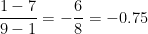 . Using the point-slope form of a line, the equation of the red string is thus


 .
. , and the
  .
. , and the
  .
. , and the
  .
. ,
,  ,
,  ,
,  .
.  ,
,  ,
,  ,
,  .
.