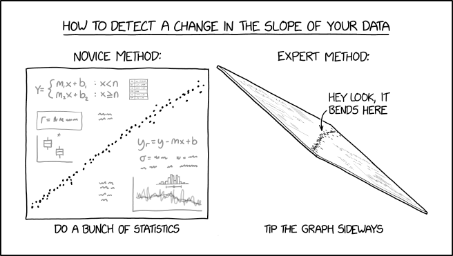
Source: https://xkcd.com/2701/
Source: https://xkcd.com/2701/
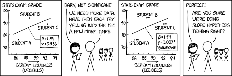
Source: https://xkcd.com/2533/
In my capstone class for future secondary math teachers, I ask my students to come up with ideas for engaging their students with different topics in the secondary mathematics curriculum. In other words, the point of the assignment was not to devise a full-blown lesson plan on this topic. Instead, I asked my students to think about three different ways of getting their students interested in the topic in the first place.
I plan to share some of the best of these ideas on this blog (after asking my students’ permission, of course).
This student submission again comes from my former student Eduardo Torres Manzanarez. His topic, from Algebra: fitting data to a quadratic function.
![]()
How could you as a teacher create an activity or project that involves your topic?
One interesting project that could be done to invoke quadratic modeling is for students to develop a model that fits a business’ data of labor and output. The basic model of labor and output for a given company can be modeled by a quadratic function and it can be used to determine important figures such as the maximum output, minimum output, maximum labor, and minimum labor. The following image is an example of such a relationship.

In general, people would think that the more labor and resources used at the exact same time results in more product. If you have more product produced, then you accumulate more profit. These ideas are not wrong to be thought of but a key aspect that is missed in the thought process is that of land or otherwise known as workspace. The more employees you hire, the more space required so that these individuals can produce but space is limited just like any other resource. Lack of space inhibits production flow and therefore decreases product, decreases profits, and increases cost through increased wages. All of this does not occur until you pass the maximum of the model. So, both of these behaviors are shown and exhibited by a quadratic function. Students can realize these notions of labor and production by analyzing data of various companies. An activity that could show such a relationship in action is having one student create a small particular product such as a card with a particular design and produce as many as they can in a certain amount of time, with certain resources, and a workspace. Record the number of cards produced. Next, have two students create cards with the exact same time, resources, and workspace and record the amount produced. As more students are involved, the behavior of labor and production will be shown to be direct and then inverse to each other. The final piece for this activity would be for students to find realize what function seems to have the same shape as the data on a graph and for them to manipulate the function so that it fits on the data. Turns out the function will have to be a quadratic function.
![]()
B1) How can this topic be used in your students’ future courses in mathematics or science?
Fitting data onto a quadratic function is useful in analyzing behavior between variables. In various mathematical courses, data is provided but in science usually one must come up with data through an experiment. Particularly there are many situations in physics where this is the case and relationships have to be modeled by fitting data onto various functions. Doing quadratic modeling and even linear modeling early on is a good introduction into other models that are used in the many fields of science. Not every experiment is recorded perfectly and hence there can never be a perfect model. Through analytical skills presented in this topic, it scaffolds students to find a model for bacteria growth, a model for velocity, a model for the position of an object, and a model for nuclear decay in the future and what to expect the behavior of these models to be. This topic in combination with limits from calculus builds onto piece-wise models for probability and statistics.
![]()
E1) How can technology be used to effectively engage students with this topic?
Technology such as graphing calculators, Excel, Desmos, and TI-Nspires can be used to create the best model possible based on least-squares regression. This technology is engaging in developing models, not because of the lack of convoluted math that deals with squaring differences but rather the focus on analyzing particular models such as a quadratic model. They could be engaging for students when students can input particular sets of data they find interesting and need a way to model it. Furthermore, students can use technology to develop beautiful graphs that can be easily interpreted than rough sketches of these models. TI-Nspire software can be used by a teacher to send a particular data set to students and their own TI-Nspires. Students can then insert a quadratic function on the graphing application and manipulate the function by changing its overall shape by the mouse cursor. This allows students to dictate their own particular models and allows for comparison between models as to which is more accurate for particular data.
References
https://study.com/academy/lesson/production-function-in-economics-definition-formula-example.html
In my capstone class for future secondary math teachers, I ask my students to come up with ideas for engaging their students with different topics in the secondary mathematics curriculum. In other words, the point of the assignment was not to devise a full-blown lesson plan on this topic. Instead, I asked my students to think about three different ways of getting their students interested in the topic in the first place.
I plan to share some of the best of these ideas on this blog (after asking my students’ permission, of course).
This student submission again comes from my former student Caroline Wick. Her topic, from Algebra: approximating data to a straight line.
![]() B1. Curriculum
B1. Curriculum
How can this topic be used in your students’ future courses in mathematics or science?
Though approximating data by a straight line is a subject that is brought up in Algebra 2, it is something that students will need to use in a number of subjects down the line. Probably the most obvious subject would be statistics. Finding an approximate trend line is extremely important for a statistician so that they can predict future, unobserved data. Another example that might not be as readily noticeable would be anthropology. Anthropology is the study of humans in various parts of life. In this case, according to Brian Hopkins, anthropology can be used by stores to figure out what types of products they should stock on their shelves during different types of the year. They do this by collecting the data, then approximating the trend lines to predict how the product will sell during the same season of the next year. For example, Orange Juice and tissues are known to be sold more often during the winter seasons, so stores know that they want to stock up on orange juice and tissue during the colder season each year.
![]()
A1: Applications
What interesting (i.e., uncontrived) word problems using this topic can your students do now?
Using the data given below:
(a) plot the points on a graph
(b) Then, using a ruler, do your best to approximate a trend line that fits the points
(c) Write an equation (y=mx+b) that best fits the trend line
(d) Approximate the next four numbers on the line using the equation you created.Population growth in squirrels in TX from 1950-1980 (in millions)*
Year (x) 1950 1955 1960 1965 1970 1975 1980
Pop. (y) 12 12.7 13.1 13 13.6 13.7 14
From here the student would create his/her graph with the plotted points, find a line that best fits the points with equal numbers over and under the line. They would then use the data and the line to find an equation that best fits the scatter plot data that they graphed. They would then find the approximate squirrel population for 1985, 1990, 1995, and 2000.
This could be either an assignment or it could turn into a project for students with different sets of data. Students could even collect their own data to formulate the graph and equation.
*not real data, fabricated for this problem specifically.
![]()
Culture
How has this topic appeared in pop culture (movies, TV, current music, video games, etc.)?
The approximation of data through trend lines has been used in pop culture since the birth of popular culture in the mid twentieth century. More relevantly, it is used to map certain cultural trends. When a new movie is coming out, statisticians use previous data from people who watched/reviewed the movie before its release to map out how they believe it will be appreciated by the public. A movie that did will before its release will likely have a positive trend line that continues upward at a somewhat steady rate. It will get more tickets at the box office than a movie that was not as well liked that might have a less-steep slope. Statisticians use this same trend approximation with TV shows and whether they should run another season, or in music when it hits the top of the charts. The more people listen to a song, the more likelihood it has to be listened to other people, thus the trend continues upward until is slowly dies off.
Take for instance, Taylor Swift’s “Look What You Made Me Do” that was released August 25th of this year. From its release and popularity, statisticians were able to track the data and predict that the song would be number 1 on the top 100 just a few weeks after its release.
References:
B1: https://www.cio.com/article/2372429/enterprise-architecture/the-anthropology-of-data.html
C1: http://www.billboard.com/articles/news/7949029/taylor-swift-look-what-you-made-me-do-timeline-reputation
Last month, my latest professional article, Deriving the Regression Line with Algebra, was published in the April 2017 issue of Mathematics Teacher (Vol. 110, Issue 8, pages 594-598). Although linear regression is commonly taught in high school algebra, the usual derivation of the regression line requires multidimensional calculus. Accordingly, algebra students are typically taught the keystrokes for finding the line of best fit on a graphing calculator with little conceptual understanding of how the line can be found.
In my article, I present an alternative way that talented Algebra II students (or, in principle, Algebra I students) can derive the line of best fit for themselves using only techniques that they already know (in particular, without calculus).
For copyright reasons, I’m not allowed to provide the full text of my article here, though subscribers to Mathematics Teacher should be able to read the article by clicking the above link. (I imagine that my article can also be obtained via inter-library loan from a local library.) That said, I am allowed to share a macro-enabled Microsoft Excel spreadsheet that I wrote that allows students to experimentally discover the line of best fit:
http://www.math.unt.edu/~johnq/ExploringTheLineofBestFit.xlsm
I created this spreadsheet so that students can explore (which is, after all, the first E of the 5-E model) the properties of the line of best fit. In this spreadsheet, students can enter a data set with up to 10 points and then experiment with different slopes and 
In this series, I’m compiling some of the quips and one-liners that I’ll use with my students to hopefully make my lessons more memorable for them. Today’s story is a continuation of yesterday’s post.
When I teach regression, I typically use this example to illustrate the regression effect:
Suppose that the heights of fathers and their adult sons both have mean 69 inches and standard deviation 3 inches. Suppose also that the correlation between the heights of the fathers and sons is 0.5. Predict the height of a son whose father is 63 inches tall. Repeat if the father is 78 inches tall.
Using the formula for the regression line

we obtain the equation

so that the predicted height of the son is 66 inches if the father is 63 inches tall. However, the prediction would be 73.5 inches if the father is 76 inches tall. As expected, tall fathers tend to have tall sons, and short fathers tend to have short sons. Then, I’ll tell my class:
However, to the psychological comfort of us short people, tall fathers tend to have sons who are not quite as tall, and short fathers tend to have sons who are not quite as short.
This was first observed by Francis Galton (see the Wikipedia article for more details), a particularly brilliant but aristocratic (read: snobbish) mathematician who had high hopes for breeding a race of super-tall people with the proper use of genetics, only to discover that the laws of statistics naturally prevented this from occurring. Defeated, he called this phenomenon “regression toward the mean,” and so we’re stuck with called fitting data to a straight line “regression” to this day.
In this series, I’m compiling some of the quips and one-liners that I’ll use with my students to hopefully make my lessons more memorable for them.
When I teach regression, I typically use this example to illustrate the regression effect:
Suppose that the heights of fathers and their adult sons both have mean 69 inches and standard deviation 3 inches. Suppose also that the correlation between the heights of the fathers and sons is 0.5. Predict the height of a son whose father is 63 inches tall. Repeat if the father is 78 inches tall.
Using the formula for the regression line
we obtain the equation
so that the predicted height of the son is 66 inches if the father is 63 inches tall. However, the prediction would be 73.5 inches if the father is 76 inches tall.
To make this more memorable for students, I’ll observe:
As expected, tall fathers tend to have tall sons, and short fathers tend to have short sons. For example, my uncle was 6’6″. His two sons, my cousins, were 6’4″ and 6’5″ and were high school basketball stars.
My father was 5’3″. I became a math nerd.
I really enjoyed a recent Math With Bad Drawings post on how descriptive statistics can be used to deceive. For example:


See the rest of the post for similar picture for mean, median, mode, and variance (equivalent to standard deviation); I’ll be using these in my future statistics classes.

Source: http://www.xkcd.com/1725/
In my capstone class for future secondary math teachers, I ask my students to come up with ideas for engaging their students with different topics in the secondary mathematics curriculum. In other words, the point of the assignment was not to devise a full-blown lesson plan on this topic. Instead, I asked my students to think about three different ways of getting their students interested in the topic in the first place.
I plan to share some of the best of these ideas on this blog (after asking my students’ permission, of course).
This student submission again comes from my former student Loc Nguyen. His topic, from Algebra: fitting data to a quadratic function.
![]()
A1. What interesting (i.e., uncontrived) word problems using this topic can your students do now?
To engage students on this topic, I will provide them the word problems in the real life so they can see the usefulness of quadratic regression in predictive purposes. The question to the problem is about the estimated numbers of AIDS cases that can be diagnosed in 2006. The data only show from 1999 to 2003. This will be students’ job to figure out the prediction. I will provide the instructions for this task and I will also walk them through the process of finding the best curve that fit the given data. The best fit to the curve will give us the estimation. Here is how the instruction looks like:

In the end, students will be able to acquire the parabola curve which fit the given data. By letting students work through the real life problems, they will be able to understand why mathematics is important and see how this concept is useful in their lives.
![]()
B2. How does this topic extend what your students should have learned in previous courses?
Before getting into this topic, the students should have eventually been familiar with the word “quadratic” such as quadratic function, quadratic equation. Students should have been taught when the curve concaves up or down. In the previous course, students would be given the quadratic functions and they would be asked to find the maxima, minima, or intercepts. Or they would be asked to solve the quadratic equation and find the roots. The universal properties of quadratic function never change. When students encountered the concept of quadratic regression, they would not be so overwhelmed with the topic. There is no new rule or properties. The process is just backward. The Instead of having the given function, in this case, students will have to find the function based on the given data so that the curve would fit the data. Their prior knowledge is really essential for this topic, and this would help them to understand the concept of quadratic regression easier.
![]()
C1. How has this topic appeared in pop culture (movies, TV, current music, video games, etc.)?
At the beginning of the class, I would like to show students the short video of football incident.
This incident was really interesting. The Titans punt went so high so that it hit the scoreboard in Cowboys stadium. Surprisingly, this was Cowboy’s new stadium. There were many questions about what was going on when the architecture built this stadium. It was supposed to be great. This incident revealed the errors in predicting the height of the scoreboard. The data they collected in past year may have been incorrect. I want to incorporate this incident into the concept of quadratic regression. I will pose several questions such as:
Was Titan football punter really that powerful? What was really wrong in this situation?
When the architectures built this stadium, did they ever think that the ball would reach the ceiling?
How come did the architectures fail to measure the height of the ceiling? Did they just assume the height of the stadium tall enough?
What was the path of the ball?
Students will eagerly respond to these questions, and I will slowly bring in the important of quadratic regression. I will then explain how quadratic regression helps us to predict the height based on collected data from past years.
References:
https://www.youtube.com/watch?v=V4N3LEi5a1Q
http://www.algebralab.org/Word/Word.aspx?file=Algebra_QuadraticRegression.xml
