Engaging students: Defining a function of one variable

In my capstone class for future secondary math teachers, I ask my students to come up with ideas for engaging their students with different topics in the secondary mathematics curriculum. In other words, the point of the assignment was not to devise a full-blown lesson plan on this topic. Instead, I asked my students to think about three different ways of getting their students interested in the topic in the first place.

I plan to share some of the best of these ideas on this blog (after asking my students’ permission, of course).

This student submission again comes from my former student Lydia Rios. Her topic, from Algebra: defining a function of one variable.

green line

How does this topic extend what your students should have learned in previous courses?

From Prekindergarten and up, students have been practicing skills that prepared them from the concepts of a function. By counting they knew that they were adding that same number to every other number in the same sequence. By doing 1,2,3,4,5,… counting by ones they realized that every left number was being added by one to get the right number. They were taking the input 2 and doing the operation of addition by 1 to get the output of 3. The same thing was happening for other counting sequences, or even general operation statements such as 1+7=8. They have been building up to the idea of functions without recognizing that they were. You can use this no simple idea that’s been installed in them to understand what functions are. You can build them up from here and then start giving them statements with a missing component so they can find a missing variable. Then finally, building them towards defining a function where you give them similar statements with a missing component so that they can start writing out their own equations. *Don’t forget to introduce input and output and that are function represent the relationship between out input (x) is having this operation done to it to get our output (y).

Mathematics Vertical Alignment, Prekindergarten-Grade 2 (texas.gov)

Introduction to Functions | Boundless Algebra (lumenlearning.com)

green line

How has this topic appeared in pop culture (movies, TV, current music, video games, etc.)?

You could use different appearances in pop culture to get students to understand input and output, such as when you are playing video games you are putting your input on the controller to get the output on the screen. However, this may not have an association with function unless you want to start getting into detail about programming. Therefore, to bring about the topic of functions I would just use a word problem that associates with pop culture. You could also bring the business side of pop culture into the class, such as setting up an equation that shows how the more tickets bought makes and increased revenue for the production of a movie. For example, lets say a ticket cost $8.50 and the production get’s 40% of the profit. Then you could set up the equal as 0.40(8.5X)=Y with 0.40 representing 40% of the profit that the production team will receive of the $8.50 tickets.

green line

How has this topic appeared in high culture (art, classical music, theatre, etc.)?

The topic of inputs and outputs can be touched on in reference to theatre. Both in lighting and sound, inputs and outputs are used. Therefore, the concept of this can be taught to the students. For lighting, you can talk about DMX which is what LED lights use so that the technology in the lights can pick up the functions that the computer is telling it to do. You connect the DMX in cord to the DMX in into the lighting board and then the DMX out of the lighting board to the DMX out on the lights. The same idea works with audio. However, the inputs are the microphones and the outputs are the speakers. You would take the microphone aux cord and plug that into the inputs on the Sound Board and then you would take the speaker cord and plug that into the outputs on the Sound Board. Therefore, that particular microphone is connected to that speaker and will only come out of that speaker.

“Welcome to Coolmath.” Cool Math – Free Online Cool Math Lessons, Cool Math Games & Apps, Fun Math Activities, Pre-Algebra, Algebra, Precalculus, www.coolmath.com/algebra/15-functions.
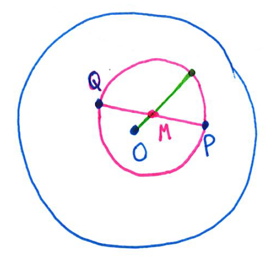
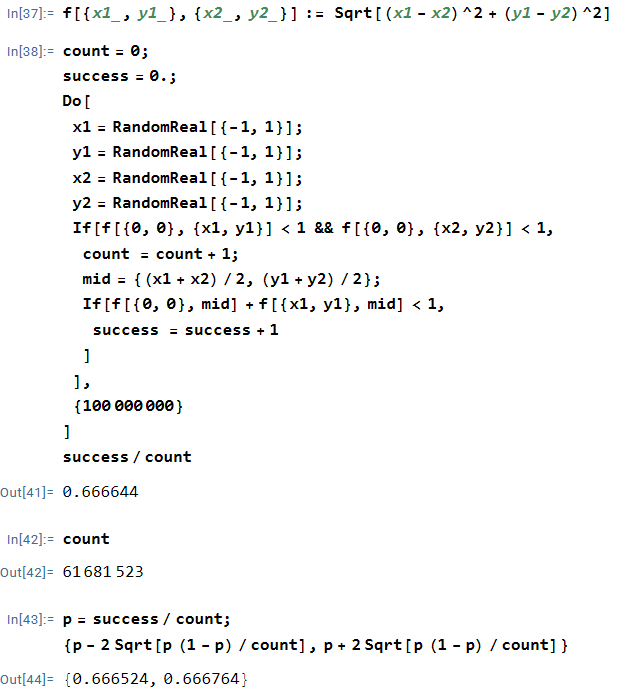
Thoughts on Numerical Integration (Part 23): The normalcdf function on TI calculators

I end this series about numerical integration by returning to the most common (if hidden) application of numerical integration in the secondary mathematics curriculum: finding the area under the normal curve. This is a critically important tool for problems in both probability and statistics; however, the antiderivative of \displaystyle \frac{1}{\sqrt{2\pi}} e^{-x^2/2} cannot be expressed using finitely many elementary functions. Therefore, we must resort to numerical methods instead.

In days of old, of course, students relied on tables in the back of the textbook to find areas under the bell curve, and I suppose that such tables are still being printed. For students with access to modern scientific calculators, of course, there’s no need for tables because this is a built-in function on many calculators. For the line of TI calculators, the command is normalcdf.

Unfortunately, it’s a sad (but not well-known) fact of life that the TI-83 and TI-84 calculators are not terribly accurate at computing these areas. For example:

TI-84: \displaystyle \int_0^1 \frac{e^{-x^2/2}}{\sqrt{2\pi}} \, dx \approx 0.3413447\underline{399}

Correct answer, with Mathematica: 0.3413447\underline{467}\dots

TI-84: \displaystyle \int_1^2 \frac{e^{-x^2/2}}{\sqrt{2\pi}} \, dx \approx 0.1359051\underline{975}

Correct answer, with Mathematica: 0.1359051\underline{219}\dots

TI-84: \displaystyle \int_2^3 \frac{e^{-x^2/2}}{\sqrt{2\pi}} \, dx \approx 0.021400\underline{0948}

Correct answer, with Mathematica: 0.021400\underline{2339}\dots

TI-84: \displaystyle \int_3^4 \frac{e^{-x^2/2}}{\sqrt{2\pi}} \, dx \approx 0.0013182\underline{812}

Correct answer, with Mathematica: 0.0013182\underline{267}\dots

TI-84: \displaystyle \int_4^5 \frac{e^{-x^2/2}}{\sqrt{2\pi}} \, dx \approx 0.0000313\underline{9892959}

Correct answer, with Mathematica: 0.0000313\underline{84590261}\dots

TI-84: \displaystyle \int_5^6 \frac{e^{-x^2/2}}{\sqrt{2\pi}} \, dx \approx 2.8\underline{61148776} \times 10^{-7}

Correct answer, with Mathematica: 2.8\underline{56649842}\dots \times 10^{-7}

I don’t presume to know the proprietary algorithm used to implement normalcdf on TI-83 and TI-84 calculators. My honest if brutal assessment is that it’s probably not worth knowing: in the best case (when the endpoints are close to 0), the calculator provides an answer that is accurate to only 7 significant digits while presenting the illusion of a higher degree of accuracy. I can say that Simpson’s Rule with only n = 26 
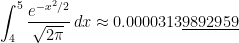
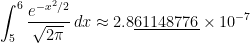
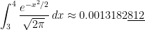
subintervals provides a better approximation to \displaystyle \int_0^1 \frac{e^{-x^2/2}}{\sqrt{2\pi}} \, dx than the normalcdf function.

For what it’s worth, I also looked at the accuracy of the NORMSDIST function in Microsoft Excel. This is much better, almost always producing answers that are accurate to 11 or 12 significant digits, which is all that can be realistically expected in floating-point double-precision arithmetic (in which numbers are usually stored accurate to 13 significant digits prior to any computations).

Engaging students: Making and interpreting bar charts, frequency charts, pie charts, and histograms

In my capstone class for future secondary math teachers, I ask my students to come up with ideas for engaging their students with different topics in the secondary mathematics curriculum. In other words, the point of the assignment was not to devise a full-blown lesson plan on this topic. Instead, I asked my students to think about three different ways of getting their students interested in the topic in the first place.

I plan to share some of the best of these ideas on this blog (after asking my students’ permission, of course).

This student submission comes from my former student Taylor Bigelow. Her topic, from Pre-Algebra: making and interpreting bar charts, frequency charts, pie charts, and histograms.

green line

How could you as a teacher create an activity or project that involves your topic?

Charts allow for a lot of fun class activities. For example, we can have them take their own data for a table and create charts from that data. For my activity, I will give them all dice, which they should be very familiar with, and have them roll the dice 20 times and keep track of how many times it lands on each number in a table. From that table, they will make their own bar charts, frequency charts, and pie charts. After they roll their dice and make their charts, they will then answer questions interpreting the charts. This tests their ability to understand data and make all the different types of charts.

green line

How has this topic appeared in the news?

Charts are all over in the news, especially recently. There were pie charts and frequency charts all over during the election cycle, and with covid, all we see is bar charts of covid data. An easy engage for this topic would be to make observations about these types of graphs that they’ll probably see all the time during election seasons and might even be familiar with. First, we will ask the students what news can benefit from graphs, and what news they have seen graphs in recently. I expect answers similar to elections, covid, and economics. Then we can look at some of the graphs that usually show up around election cycles. We will take a minute as a class to discuss what they notice about the graphs and what they mean. Questions like “what type of graph is this”, “what are the variables in this graph”, and “what information do you get from this graph”. This will show the students that being able to read these graphs has real life applications, and it also teaches them what important things to look for in the graphs during class time and homework.

green line

How can technology be used to effectively engage students with this topic?

Technology is very useful for making graphs and being able to make and manipulate graphs can help them understand how to interpret the information given in graphs. Google sheets or excel can both be used to make and manipulate graphs. For this activity we would give the students some sample data and have them enter it into an online spreadsheet, and then make an appropriate graph to show this data. They then would answer questions about this graph, like “Why did you choose this type of graph to represent the data?”, “what is the independent variable and what is the dependent variable”, “What observations can you make about this graph?”, and “What would happen if you changed X to be # instead? Or if you added more information?” and other questions, especially about graphs with multiple variables. This helps students see how different information can be represented and lets them experiment with the information on their own, while also answering questions that steer them in the direction that the teacher wants them to know.

Engaging students: Fitting data to a quadratic function

In my capstone class for future secondary math teachers, I ask my students to come up with ideas for engaging their students with different topics in the secondary mathematics curriculum. In other words, the point of the assignment was not to devise a full-blown lesson plan on this topic. Instead, I asked my students to think about three different ways of getting their students interested in the topic in the first place.

I plan to share some of the best of these ideas on this blog (after asking my students’ permission, of course).

This student submission again comes from my former student Eduardo Torres Manzanarez. His topic, from Algebra: fitting data to a quadratic function.

green line

How could you as a teacher create an activity or project that involves your topic?

One interesting project that could be done to invoke quadratic modeling is for students to develop a model that fits a business’ data of labor and output. The basic model of labor and output for a given company can be modeled by a quadratic function and it can be used to determine important figures such as the maximum output, minimum output, maximum labor, and minimum labor. The following image is an example of such a relationship.

In general, people would think that the more labor and resources used at the exact same time results in more product. If you have more product produced, then you accumulate more profit. These ideas are not wrong to be thought of but a key aspect that is missed in the thought process is that of land or otherwise known as workspace. The more employees you hire, the more space required so that these individuals can produce but space is limited just like any other resource. Lack of space inhibits production flow and therefore decreases product, decreases profits, and increases cost through increased wages. All of this does not occur until you pass the maximum of the model. So, both of these behaviors are shown and exhibited by a quadratic function. Students can realize these notions of labor and production by analyzing data of various companies. An activity that could show such a relationship in action is having one student create a small particular product such as a card with a particular design and produce as many as they can in a certain amount of time, with certain resources, and a workspace. Record the number of cards produced. Next, have two students create cards with the exact same time, resources, and workspace and record the amount produced. As more students are involved, the behavior of labor and production will be shown to be direct and then inverse to each other. The final piece for this activity would be for students to find realize what function seems to have the same shape as the data on a graph and for them to manipulate the function so that it fits on the data. Turns out the function will have to be a quadratic function.

green line

B1) How can this topic be used in your students’ future courses in mathematics or science?

Fitting data onto a quadratic function is useful in analyzing behavior between variables. In various mathematical courses, data is provided but in science usually one must come up with data through an experiment. Particularly there are many situations in physics where this is the case and relationships have to be modeled by fitting data onto various functions. Doing quadratic modeling and even linear modeling early on is a good introduction into other models that are used in the many fields of science. Not every experiment is recorded perfectly and hence there can never be a perfect model. Through analytical skills presented in this topic, it scaffolds students to find a model for bacteria growth, a model for velocity, a model for the position of an object, and a model for nuclear decay in the future and what to expect the behavior of these models to be. This topic in combination with limits from calculus builds onto piece-wise models for probability and statistics.

green line

E1) How can technology be used to effectively engage students with this topic?

Technology such as graphing calculators, Excel, Desmos, and TI-Nspires can be used to create the best model possible based on least-squares regression. This technology is engaging in developing models, not because of the lack of convoluted math that deals with squaring differences but rather the focus on analyzing particular models such as a quadratic model. They could be engaging for students when students can input particular sets of data they find interesting and need a way to model it. Furthermore, students can use technology to develop beautiful graphs that can be easily interpreted than rough sketches of these models. TI-Nspire software can be used by a teacher to send a particular data set to students and their own TI-Nspires. Students can then insert a quadratic function on the graphing application and manipulate the function by changing its overall shape by the mouse cursor. This allows students to dictate their own particular models and allows for comparison between models as to which is more accurate for particular data.

References

https://study.com/academy/lesson/production-function-in-economics-definition-formula-example.html


Engaging students: Making and interpreting bar charts, frequency charts, pie charts, and histograms

In my capstone class for future secondary math teachers, I ask my students to come up with ideas for engaging their students with different topics in the secondary mathematics curriculum. In other words, the point of the assignment was not to devise a full-blown lesson plan on this topic. Instead, I asked my students to think about three different ways of getting their students interested in the topic in the first place.

I plan to share some of the best of these ideas on this blog (after asking my students’ permission, of course).

This student submission comes from my former student Johnny Aviles. His topic, from Pre-Algebra: making and interpreting bar charts, frequency charts, pie charts, and histograms.

green line

A2. How could you as a teacher create an activity or project that involves your topic?

I would create a project where my students would make and interpreting bar charts, frequency charts, pie charts, and histograms. First, I would begin by using the class as data by asking them questions and use a specific chart for each question. For example, I would ask “who here is Team iPhone? Team Android? or who doesn’t care?” Essentially, I will be separating the class in select groups based on their preference of phone. I will then create a pie chart of the class based on their choice. I then would do more examples of the other charts and explain the purpose of each one and when to use it. After some more examples and practice for them to familiarize themselves with the charts, I will assign the project. I would then divide the class into 4 groups and evenly assign a chart to each student to find a real-world example to apply and create their own specified chart that they’ll present. (I divide the class to ensure that every chart gets represented.) The purpose of the project is for all the students to not only be exposed to all the charts but to also apply them and understand the use for each one.


green line

B1. How can this topic be used in your students’ future courses in mathematics or science?

In terms of mathematics, bar charts, frequency charts, pie charts, and histograms are very essential forms of data. These charts are widely used in nearly every future math or science course of students. As appose of a large spreadsheet of data that is hard to interpret, this topic provides a more organized and visual way to provide that collected data and to find useful information. A great example of using this topic is statistics. a spread sheet in given and then transformed in the form of a histogram that would give information of its distribution. With this chart, one can find things such as mean and standard deviation. Statistics also test hypothesis that require data to decide whether or not a certain drug would be effective based on data from frequency charts or histograms. These charts are also widely used in science. They can record the population of a given species, growth of bacteria in a given time, surveys, etc. There are endless possibilities in which these graphs can be applied in students’ future subjects.

green line

C3. How has this topic appeared in the news?

With the vast categories the news covers, there are many examples where bar charts, frequency charts, pie charts, and histograms have been used. The news is for the common people and the common person has socially acquired a short attention span. The news can’t just give a sheet of numbers and expect people to know what it means and let alone look at it. These charts are provided for everyone to be given vast amounts of data gathered in aesthetically pleasing chart that can be quickly interpreted. The weather uses data from previous years to predict what we could be facing in terms of temperature and rain on any given month or season. Sports are all stats that have been recorded and can predict the outcomes of future games and players stats. When a top new story unravels, news channels are quick to look up stats that relate to story and compare data for the viewer. These charts appear in the news frequently and are vital to be comprehended to future students.