Source: https://xkcd.com/2701/
Source: https://xkcd.com/2701/
Source: https://xkcd.com/2711/
In my capstone class for future secondary math teachers, I ask my students to come up with ideas for engaging their students with different topics in the secondary mathematics curriculum. In other words, the point of the assignment was not to devise a full-blown lesson plan on this topic. Instead, I asked my students to think about three different ways of getting their students interested in the topic in the first place.
I plan to share some of the best of these ideas on this blog (after asking my students’ permission, of course).
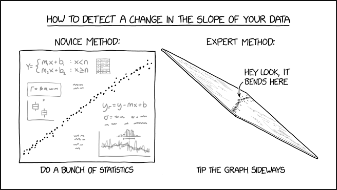
This student submission again comes from my former student Morgan Mayfield. His topic, from Algebra: graphs of linear equations.
![]()
What interesting (i.e., uncontrived) word problems using this topic can your students do now? (You may find resources such as http://www.spacemath.nasa.gov to be very helpful in this regard; feel free to suggest others.)
Given a rather vague statement such as ”Graphs of Linear Equations”, I was unsure if it meant only the technique of analyzing graphs or being able to have the ability to build a graph of a linear equation. In A1, I attempt to rely on analysis. Here are the problems I encountered on Space Math @ NASA:
Space Math has these problems listed as “Finding the slope of a linear graph”, the two key phrases being “Finding the slope” and “linear graph”. The students must be able to do both. Students are given three sets of graphical data to analyze (shown below). I am not an expert in any of these fields, but I suspect these graphs were made using real data scientists collected. The Space Math team gave students two points on the data to aid in calculations. What makes these graphs interesting is the fact that they are messy, but real compared to a graph of a linear equation in a classroom. These graphs can be analyzed further than the problems Space Math offered. Students could see how that data can be collected and put into a scatterplot, like in the case of graph 2, and have an approximately linear correlation. Sadly, most things don’t follow a neat model of what we see in our math class, yet we can still derive meaning from real-world phenomena because of what we learn in math class. Scientists use their understanding of graphs of linear equations and linear models to analyze data and come to conclusions about our real-world environment. In graph 2, a scientist would clearly see that there is a linear proportional relationship between the speed and distance from the Hubble space telescope of a galaxy, or more meaningfully understood as a rate, 76 km/sec/mpc. Now, if a scientist encountered a new galaxy, they could determine an approximate speed or distance of the galaxy given the other variable.

![]()
How can this topic be used in your students’ future courses in mathematics or science?
Students will formalize learning about graphing linear function in Algebra I. Graphs of linear equations are important in solving linear inequalities in two variables, solving systems of linear inequalities, solving systems of linear equations, and solving systems of equations involving linear and nonlinear equations which are all topics in Algebra I and II. Solving systems can be done algebraically, but graphing systems give students a more concrete way in finding a solution and is an excellent way of conveying information to others. If a student ever found themself in a business class, they may be asked to make “business decisions” on a product to buy. If I were the student explaining my decision to my teacher and potential “investors”, I would be making a graph of linear systems to help explain my “business decisions”. Generally, a business class would also introduce “Supply and Demand” graphs, where the solution is called the “equilibrium”. Many graphs in an intro class depict supply and demand as a system of linear equations.
In the high school sciences, a student will come across many linear equations. Students in a regular physics course and an AP physics course will come across simplified distance vs. time graphs to represent velocity, velocity vs. time graphs to represent acceleration, and force vs. distance graphs to represent work and energy (khan academy link included below). Note, just because many of the examples used in a physics class are graphs of linear equations, real life rarely works out like this.
![]()
How has this topic appeared in pop culture (movies, TV, current music, video games, etc.)?
We are shown data daily that our climate is changing fast through infographics on social media, posters set up by environmentalists, and news broadcasting. Climate change is one of the most important issues that society faces today and is on the collective consciousness of my generation as we have already seen the early consequences of climate change. Climate change, like most real-world data collecting does not always follow a good linear fit or any other specific fit with 100% accurately. However, a way scientists and media want to convey a message to us is to overlay a “trend line” or a “line of best fit” over the graphed data. Looking at the examples below, we can clearly understand that average global temperatures have been on the rise since 1880 despite fluctuations year-to-year and comparisons to the expected average global temperature. The same graph also gives insight on how the same data can also be cherrypicked to fit another person’s agenda. From 1998 – 2012, the rate of change, represented by a line, is lower than both 1970 – 1984 and 1984 – 1998. In fact, the rate is dramatically lower, thus climate change is no more! Not so, this period of slowing down doesn’t immediately refute the notion of climate change but could be construed as so. Actually, in the NOAA article linked below and its corresponding graph actually finds that we were using dated techniques that led to underestimates and concluded that the IPCC was wrong in it’s original analysis of 1998-2012 and that the trend was actually getting worse, indicated by the trend line on the second graph, as the global temperature departed from the long-term average.
Look at how much information could be construed by a few linear functions represented on a graph and some given rate of changes.


References:
(or Problem 226 from https://spacemath.gsfc.nasa.gov/algebra1.html)
https://d1yqpar94jqbqm.cloudfront.net/documents/Gateway5A1VAChart.pdf (or grade 5 – Algebra II Vertical Alignment https://www.texasgateway.org/resource/vertical-alignment-charts-revised-mathematics-teks)
https://bim.easyaccessmaterials.com/index.php?location_user=cchs
https://www.ncdc.noaa.gov/news/recent-global-surface-warming-hiatus
https://www.climate.gov/news-features/climate-qa/did-global-warming-stop-1998


 Taken from https://students.ga.desire2learn.com/d2l/lor/viewer/viewFile.d2lfile/1798/12938/Algebra_ReasoningwithEquationsandInequalities12.html
I’m not gonna lie… I wish I had an ugly Christmas sweater with this theme.
Source: https://www.facebook.com/photo.php?fbid=10157861645601449&set=a.115338471448&type=3&theater
Sadly, the snakes fail the vertical line test.

Source: https://www.facebook.com/photo.php?fbid=2275159199164147&set=gm.500736803735509&type=3&theater
This is one of the more creative graphs that I’ve ever seen. From the article:
Seung Lee tracked the first year of his baby’s sleep schedule with the BabyConnect app, which lets you export data to CSV. Choosing to work with six minute intervals, Lee then converted the CSVs into JSON (using Google Apps Script and Python) which created a reliable pattern for knitting. The frenetic lines at the top of the blanket indicate the baby’s unpredictable sleep schedule right after birth. We can see how the child grew into a more reliable schedule as the lines reach more columnar patterns.
![]()
In my capstone class for future secondary math teachers, I ask my students to come up with ideas for engaging their students with different topics in the secondary mathematics curriculum. In other words, the point of the assignment was not to devise a full-blown lesson plan on this topic. Instead, I asked my students to think about three different ways of getting their students interested in the topic in the first place.
I plan to share some of the best of these ideas on this blog (after asking my students’ permission, of course).
This student submission comes from my former student Lissette Molina. Her topic, from Algebra: finding 

![]()
What interesting (i.e., uncontrived) word problems using this topic can your students do now?
Using this topic, students can now use word problems that involve two variables in our everyday lives. One problem that many scientists often use is population growth. In population growth, we can usually see a trend of a line and determine the slope. We initially begin with a certain population in a certain year, this is considered the y-intercept, since we start at the initial year that we consider to be at x=0. Using the slope of the line when we are speaking in terms of population decay, we may then set our y=0 to find when a population would be equal to zero. We can also consider other examples such as the depreciation of a car, or when a business’s grows out of debt and begins to profit. Word problems include, but are not limited to, problems that involve a trend and wanting to find where that trend will lead to at a certain point, x, when we are given an initially amount or reverse this operation.
![]()
How can this topic be used in your students’ future courses in mathematics or science?
This topic crosses multiple courses in mathematics. In general, knowing the x and y-intercepts of equations help students start outlining what the graph of the function might look like. This gives part of the visual representation needed to complete part of the graph. These intercepts usually also give a prediction of what the shape of the graph may look like. A fun assignment would be giving a student two points on the graph and along with the intercepts of that equation that the points belong to. Along with this, these intercepts give us the solutions of the equations. When there are not x or y-intercepts, we would now know that the solutions do not exist or at least are imaginary. Overall, x and y-intercepts help us get a better understanding of what the graphs of almost all equations must look like. This is essentially especially when we are graphing by hand.
![]()
How can technology be used to effectively engage students with this topic?
Graphing calculators is one fun essential way of finding intercepts as well as learning functions on a calculator. When a student graphs a function on a graphing calculator, for example, the sine function, we can ask the student where they believe the graph would intercept with the x-axis. We would then ask them to find the intercepts using the calculator by pressing [2nd][trace][4] function and proceed to find the approximated x-intercepts. The student would then find that the intercepts occur at every npi/2. Essentially, using this function is an interesting way of estimating the intercepts along the graph in an interactive way. Other online graphing calculators may do this as well and give students a better understanding of where the intercepts occur.
In my capstone class for future secondary math teachers, I ask my students to come up with ideas for engaging their students with different topics in the secondary mathematics curriculum. In other words, the point of the assignment was not to devise a full-blown lesson plan on this topic. Instead, I asked my students to think about three different ways of getting their students interested in the topic in the first place.
I plan to share some of the best of these ideas on this blog (after asking my students’ permission, of course).
This student submission again comes from my former student Austin Carter. His topic, from Algebra: solving linear systems of inequalities.
![]()
How does this topic extend what your students should have learned in previous courses?
System of equations can be solved in several ways. Changing from linear systems to systems of inequalities only means there is a range of viable answers, but the processes for solving them remain the same; graphing, elimination, substitution, or matrices. Learning how to deal with inequalities will also give us access to more interesting real world problems, because we don’t always need an exact value; sometimes we need at least this much or no more than a certain amount. For example:
![]()
How can technology be used to effectively engage students with this topic?
Systems of inequalities are most easily understood with visual aid. Different colors for each equation, dotted line vs. solid line, and shading are all major components of inequalities and being able to see how each shaded region overlaps is invaluable to understanding the answer. In my experience, the easiest tool to visualize all these components is the desmos online calculator. Desmos is very user friendly and will accept equations in any form. Also, it assigns different colors to each equation entered, allows students to zoom in and out to see detail on any scale, and allows students to “click and drag” and equation line to see the (x,y) components at that location. Desmos could be used to have students create their own graphs and explain the limiting factors of their picture.
![]()
Application/Technology
Sensors are how our electronics interact with the real world. Just think about a car, and how many things are being measured and monitored constantly. Every one of those sensors is responsible for measuring something specific and making sure that measurement stays within an acceptable range. What happens if your car gets too hot? What happens if you don’t buckle your seatbelt? As autonomous vehicles come online, what happens if that vehicle gets too close to another object? All of these things are measured by sensors, and those measurements are constantly being run through software to make sure those measurements stay within an acceptable range. But how does the software determine what an acceptable range is? The software uses system of inequalities to make sure every single measurement stays within an acceptable range, and if it doesn’t it alerts the driver. The world as we know it would come crumbling down without the sensors we rely on daily, but the information those sensors collect would be useless if we didn’t have systems of inequalities to make the data meaningful.
References:
Solve Real-World Problems Using Inequalities. (2015, July 7). Retrieved September 14, 2018, from https://students.ga.desire2learn.com/d2l/lor/viewer/viewFile.d2lfile/1798/12938/Algebra_ReasoningwithEquationsandInequalities7.html

