In my capstone class for future secondary math teachers, I ask my students to come up with ideas for engaging their students with different topics in the secondary mathematics curriculum. In other words, the point of the assignment was not to devise a full-blown lesson plan on this topic. Instead, I asked my students to think about three different ways of getting their students interested in the topic in the first place.
I plan to share some of the best of these ideas on this blog (after asking my students’ permission, of course).
This student submission again comes from my former student Esmerelda Sheran. Her topic, from Algebra: approximating data by a straight line.

A.2) How could you as a teacher create an activity or project that involves your topic?
If I created an activity for my class over approximating data by using a straight line I would make sure the type of data, they use is something that is relevant or interesting in the student’s lives. I would have the students work in pairs and choose the data they would work with out of three sets of data I have chosen. Examples of the choices of data would be the relationships between interceptions and wins for NFL teams, car accidents and age, or attendance and GPA (in college/universities). Using the data they chose the students would first take an educated guess of how the graph would look like, draw the scatter plot associated with the data, and compare their guess to the actual graph. At that point the students would try to identify the parent function (xb+c, mx+b, ab, ln(x) etc.) that the data is most similar to or if the data even has correlation. They would then draw what they believed the best fit line would look like on the scatterplot which they would compare to the linear regression once they calculated it on a graphing calculator. I would hope that this activity would be interesting due to the data being real and relatable as well as it being a way to connect parent functions and statistical data.
D.1) What interesting things can you say about the people who contributed to the discovery and/or the development of this topic?
Two of the main collaborators of linear regression are Sir Francis Galton and Karl Pearson. Galton was the discoverer of the linear regression and Pearson further elaborated on Galton’s ideas. Linear regression actually came to be because of sweet peas, Galton was studying heredity in sweet peas and formulated linear regression to aid him in studying the relations he found in his studies. Galton was much more than a hereditist, he was a geologist, meteorologist, tropical explorer, founder of differential psychology, inventor of fingerprint identifications, and an author. A few more interesting things about Galton is that he was knighted, he was accused of promoting eugenics, he was British and he was a half cousin of Charles Darwin. If you were wondering what “eugenics” is, it is the idea of planned breeding of humans through selectively breeding and sterilization. Galton once said, “… I object to pretensions of natural equality.” Being that Galton studied heredity it is no wonder that he felt that some physical/mental/emotional attributes where superior and that humans would benefit from having the “best” genes. Unfortunately for Galton eugenics was frowned upon and he was attacked for promoting it. I think that students would find Galton extremely interesting because of his wide variety of interests.
Karl Pearson, although not as complex as Galton had a few attributes that I feel would interest students. Pearson did not have a childhood that would be considered normal in modern day. Pearson was homeschooled up until he turned nine, and then he went to London alone to study at the University of College School. After he received his degrees and studied physics, metaphysics and Darwinism, Pearson developed his own view in social Darwinism. The social beliefs, he developed led him to changing his name from Carl to Karl.
E.1) How can technology be used to effectively engage students with this topic?
Technology in the classroom has and always will be an effective way to engage students if used correctly. To engage my students to learn how to approximated data with a straight line I would use excel, a smartboard, or the khan academy website. Excel is a useful piece of technology that is underappreciated by the average Joe. With a set of data you can record the relationships and then use the tools to create a scatterplot and then find the linear regression line on the graph.
Using a smartboard in the classroom is effective because it is new technology that is very special and kind of rare. Using smartboard to graph the points of data and then drawing an approximated regression line is highly kinesthetic and gives hands-on experiences instead of just typing in number and getting a calculated result that required almost no brain power. Kinesthetically moving their arms up, down, or side to side helps the students get a feel for the variation and relations between the data and drawing a best fit line themselves help the student understand the data on a different level. The Khan Academy website is a great resource for being introduced and even mastering the concept of linear regression because of the different activities available. For visual and auditory learners, there are a series of videos that explain approximating data by linear regression as well as how to be the most accurate when approximating. Similarly, there is an activity for kinesthetic learners in which they can move a line around to see which line seems most like the best fit line. It is beneficial from an instructor to use this website to help students of all learning types.
References
http://www.mirror.co.uk/news/uk-news/elderly-priest-found-dead-after-5099110
https://www.dartmouth.edu/~matc/math5.geometry/unit2/unit2.html
http://geomhistory.com/home.html
http://www.americanegypt.com/feature/cities/chichenitza/castillo_shadow.htm
https://explorable.com/greek-geometry
 with
with  points. We want to perform a linear regression, but first we sort the
  values and the
  values independently of each other, forming data set
  . Is there any meaningful interpretation of the regression on the new data set? Does this have a name?
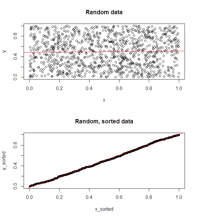

