A nice news article on Bayesian statistics

The New York Times consistently provides the best coverage of mathematics and science by a traditional news outlet. Today, I’d like to feature their article The Odds, Updated Continually, which gives a nice synopsis of the growth of Bayesian statistics in recent years and how Bayesian statistics differs from the frequentist interpretation of statistics. For example:

Statistics may not sound like the most heroic of pursuits. But if not for statisticians, a Long Island fisherman might have died in the Atlantic Ocean after falling off his boat early one morning last summer.

The man owes his life to a once obscure field known as Bayesian statistics — a set of mathematical rules for using new data to continuously update beliefs or existing knowledge…

The essence of the frequentist technique is to apply probability to data. If you suspect your friend has a weighted coin, for example, and you observe that it came up heads nine times out of 10, a frequentist would calculate the probability of getting such a result with an unweighted coin. The answer (about 1 percent) is not a direct measure of the probability that the coin is weighted; it’s a measure of how improbable the nine-in-10 result is — a piece of information that can be useful in investigating your suspicion.

By contrast, Bayesian calculations go straight for the probability of the hypothesis, factoring in not just the data from the coin-toss experiment but any other relevant information — including whether you’ve previously seen your friend use a weighted coin.

Scientists who have learned Bayesian statistics often marvel that it propels them through a different kind of scientific reasoning than they’d experienced using classical methods.

“Statistics sounds like this dry, technical subject, but it draws on deep philosophical debates about the nature of reality,” said the Princeton University astrophysicist Edwin Turner, who has witnessed a widespread conversion to Bayesian thinking in his field over the last 15 years…

The Coast Guard has been using Bayesian analysis since the 1970s. The approach lends itself well to problems like searches, which involve a single incident and many different kinds of relevant data, said Lawrence Stone, a statistician for Metron, a scientific consulting firm in Reston, Va., that works with the Coast Guard.

At first, all the Coast Guard knew about the fisherman was that he fell off his boat sometime from 9 p.m. on July 24 to 6 the next morning. The sparse information went into a program called Sarops, for Search and Rescue Optimal Planning System. Over the next few hours, searchers added new information — on prevailing currents, places the search helicopters had already flown and some additional clues found by the boat’s captain.

The system couldn’t deduce exactly where Mr. Aldridge was drifting, but with more information, it continued to narrow down the most promising places to search.

Just before turning back to refuel, a searcher in a helicopter spotted a man clinging to two buoys he had tied together. He had been in the water for 12 hours; he was hypothermic and sunburned but alive.

Even in the jaded 21st century, it was considered something of a miracle.

Education is not Moneyball

I initially embraced value-added methods of teacher evaluation, figuring that they could revolutionize education in the same way that sabermetricians revolutionized professional baseball. Over time, however, I realized that this analogy was somewhat flawed. There are lots of ways to analyze data, and the owners of baseball teams have a real motivation — they want to win ball games and sell tickets — to use data appropriately to ensure their best chance of success. I’m not so sure that the “owners” of public education — the politicians and ultimately the voters — share this motivation.

An excellent editorial the contrasting use of statistics in baseball and in education appeared in Education Week: http://www.edweek.org/tm/articles/2014/08/27/fp_eger_valueadded.html?cmp=ENL-TU-NEWS1 I appreciate the tack that this editorial takes: the author is not philosophically opposed to sabermetric-like analysis of education but argues forcefully that, pragmatically, we’re not there yet.

Both the Gates Foundation and the Education Department have been advocates of using value-added models to gauge teacher performance, but my sense is that they are increasingly nervous about accuracy and fairness of the new methodology, especially as schools transition to the Common Core State Standards.

There are definitely grounds for apprehensiveness. Oddly enough, many of the reasons that the similarly structured WAR [Wins Above Replacement] works in baseball point to reasons why teachers should be skeptical of value-added models.

WAR works because baseball is standardized. All major league baseball players play on the same field, against the same competition with the same rules, and with a sizable sample (162 games). Meanwhile, public schools aren’t playing a codified game. They’re playing Calvinball—the only permanent rule seems to be that you can’t play it the same way twice. Within the same school some teachers have SmartBoards while others use blackboards; some have spacious classrooms, while others are in overcrowded closets; some buy their own supplies while others are given all they need. The differences across schools and districts are even larger.

The American Statistical Association released a brief report on value-added assessment that was devastating to its advocates. ASA set out some caveats on the usage on value-added measurement (VAM) which should give education reformers pause. Some quotes:

VAMs are complicated statistical models, and they require high levels of statistical expertise. Sound statistical practices need to be used when developing and interpreting them, especially when they are part of a high-stakes accountability system. These practices include evaluating model assumptions, checking how well the model fits
the data, investigating sensitivity of estimates to aspects of the model, reporting measures of estimated precision such as confidence intervals or standard errors, and assessing the usefulness of the models for answering the desired questions about teacher effectiveness and how to improve the educational system.

VAMs typically measure correlation, not causation: Effects – positive or negative – attributed to a teacher may actually be caused by other factors that are not captured in the model.

Under some conditions, VAM scores and rankings can change substantially when a different model or test is used, and a thorough analysis should be undertaken to evaluate the sensitivity of estimates to different models.

VAMs should be viewed within the context of quality improvement, which distinguishes aspects of quality that can be attributed to the system from those that can be attributed to individual teachers, teacher preparation programs, or schools. Most VAM studies find that teachers account for about 1% to 14% of the variability in test scores, and that the majority of opportunities for quality improvement are found in the system-level conditions. Ranking teachers by their VAM scores can have unintended consequences that reduce quality.


Issues when conducting political polls

The classic application of confidence intervals is political polling: the science of sampling relatively few people to predict the opinions of a large population. However, in the 2010s, the art of political polling — constructing representative samples from a large population — has become more and more difficult.

FiveThirtyEight.com wrote a recent article, Is The Polling Industry in Statis or in Crisis?, about the nuts and bolts of conducting a survey that should provide valuable background information for anyone teaching a course in statistics. From the opening paragraphs:

There is no shortage of reasons to worry about the state of the polling industry. Response rates to political polls are dismal. Even polls that make every effort to contact a representative sample of voters now get no more than 10 percent to complete their surveys — down from about 35 percent in the 1990s.

And there are fewer high-quality polls than there used to be. The cost to commission one can run well into five figures, and it has increased as response rates have declined.1 Under budgetary pressure, many news organizations have understandably preferred to trim their polling budgets rather than lay off newsroom staff.

Cheaper polling alternatives exist, but they come with plenty of problems. “Robopolls,” which use automated scripts rather than live interviewers, often get response rates in the low to mid-single digits. Most are also prohibited by law from calling cell phones, which means huge numbers of people are excluded from their surveys.

How can a poll come close to the outcome when so few people respond to it?

Is The Polling Industry In Stasis Or In Crisis?

2014 MacArthur “Genius” grant winner and the twin prime conjecture

From http://www.macfound.org/fellows/927/:

Prime numbers have inspired great intrigue over the last centuries, and one of the most basic unanswered questions has been the spacing between two consecutive prime numbers, or the twin prime conjecture, which states that there are infinitely many pairs of primes that differ by two. Despite many efforts at proving this conjecture, mathematicians were not able to rule out the possibility that the gaps between primes continue to expand, eventually exceeding any particular bound. Zhang’s work shows that there are infinitely many consecutive primes, or pairs of primes, closer than 70 million. In other words, as you go to larger and larger numbers, the primes will not become further and further apart—you will keep finding prime pairs that differ by less than 70 million.

His work has generated significant collaborations across the community to expand on his effort, and within months of his discovery that number was reduced from 70 million to less than 5,000.

The truth about a really misleading graphic

Last month, Vox published an article that was quite critical of the ALS Ice Bucket challenge, pointing out that donations for curing prevalent diseases don’t always match the actual deaths caused by those diseases. The author included the following graphic to make her point:

The point of this post is not to debate personal or utilitarian motivations for charitable giving or to contest the main point of the author’s article.. Instead, I just want to take a focused, hard look at the above picture, which I argue is utterly misleading but has been circulated widely in social media and by reputable news organizations.

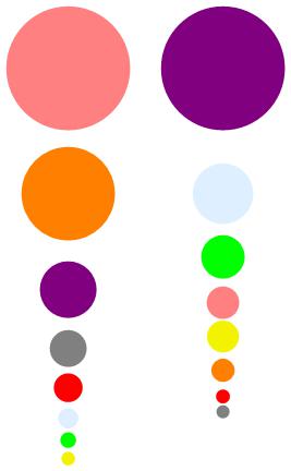
In this post, I’ll accept without argument the validity of the given numbers. For example, on the right hand side, there are about a quarter as many deaths in the United States due to Chronic Obstructive Pulmonary Disease (142,942) than Heart Disease (596,577). However, the light blue circle on the right looks microscopic compared to the purple circle. It should appear to be about one-fourth the size, but it doesn’t.

In any statistics class, we teach that in a properly drawn historgram, areas should represent relative frequencies. However, in the above picture, the numbers appear to be represented by the radii of the circles, not the areas. So the light blue circle has a radius about one-fourth of the big purple circle, and so the ratio of the areas is about one-sixteenth, not one-fourth.

Second, the area of the biggest circle on the left is not the same as the area of the biggest circle on the right, even the though the units of the two sets of circles (dollars and deaths) are not comparable. A much fairer comparison would draw the biggest circles to be the same size.

So, in my opinion, here’s a much fairer rendering of the same numbers. Notice that the difference in the areas of the purple circles (for heart disease) and the pink circles (for breast cancer) is not nearly as dramatic as in the picture below.

accuratevoxpicture


Medicine’s Uncomfortable Relationship With Math: Calculating Positive Predictive Value

Taken from: http://archinte.jamanetwork.com/article.aspx?articleid=1861033&utm_source=silverchair+information+systems&utm_medium=email&utm_campaign=archivesofinternalmedicine%3aonlinefirst04%2f21%2f2014

In 1978, Casscells et al1 published a small but important study showing that the majority of physicians, house officers, and students overestimated the positive predictive value (PPV) of a laboratory test result using prevalence and false positive rate. Today, interpretation of diagnostic tests is even more critical with the increasing use of medical technology in health care. Accordingly, we replicated the study by Casscells et al1 by asking a convenience sample of physicians, house officers, and students the same question: “If a test to detect a disease whose prevalence is 1/1000 has a false positive rate of 5%, what is the chance that a person found to have a positive result actually has the disease, assuming you know nothing about the person’s symptoms or signs?”

Approximately three-quarters of respondents answered the question incorrectly (95% CI, 65% to 87%). In our study, 14 of 61 respondents (23%) gave a correct response, not significantly different from the 11 of 60 correct responses (18%) in the Casscells study (difference, 5%; 95% CI, −11% to 21%). In both studies the most common answer was “95%,” given by 27 of 61 respondents (44%) in our study and 27 of 60 (45%) in the study by Casscells et al1 (Figure).

Statistics Done Wrong

I happily provide the following link to Statistics Done Wrong, a free e-book illustrating pitfalls when using statistical inference. From its description:

If you’re a practicing scientist, you probably use statistics to analyze your data. From basic t tests and standard error calculations to Cox proportional hazards models and geospatial kriging systems, we rely on statistics to give answers to scientific problems.

This is unfortunate, because most of us don’t know how to do statistics.

Statistics Done Wrong is a guide to the most popular statistical errors and slip-ups committed by scientists every day, in the lab and in peer-reviewed journals. Many of the errors are prevalent in vast swathes of the published literature, casting doubt on the findings of thousands of papers. Statistics Done Wrong assumes no prior knowledge of statistics, so you can read it before your first statistics course or after thirty years of scientific practice.

http://www.refsmmat.com/statistics/index.html

Statistical errors and their tendency to mislead

As a follow-up to yesterday’s post, here’s a recent article in the scientific journal Nature about the slippery nature of P-values, including a history about how reliance on P-values has evolved in the past 100 years or so: http://www.nature.com/news/scientific-method-statistical-errors-1.14700

While I’m personally familiar with many of the pitfalls mentioned this article, I have to admit that a couple of the issues raised are brand new to me. So I’ll refrain from editorializing until I’ve had some time to reflect more deeply on this article.